UI Design - Systems Thinking
Wireless Emergency Alert System Redesign
Wireless emergency alerts (WEAs) are the notifications from the state we receive on our phones about emergencies like Amber Alerts or natural disasters.
Using a specific example where WEAs disastrously misinformed the inhabitants of Hawaii about a non-existent ballistic missile, I investigate how the human systems and UI that produce these vital messages can be further streamlined and secured for efficient and accurate messaging.

Background
Wireless emergency alerts (WEAs) were introduced in 2012 as a way of modernizing TV alerts and providing important government updates conveniently via mobile devices.
Most federal, state, local, tribal, and territorial organizations have the capabilities to send WEAs in order to address emergencies of various scales.
More than 30,000 alerts have been sent since its introduction. WEAs are available on all mobile carriers.
WEAs are criticized for their ability to cause rapid widespread panic due to the lack of guidance it provides citizens when informing them of important news.
A Black Swan Occurrence
As designers, it is vital to prepare for the worst case scenario, otherwise known as a black swan occurrence, to ensure system fortitude.
When it comes to government systems, the ramifications of poor planning can have truly disastrous effects on the health and wellbeing of the general public.
In January 2018, a WEA mistakenly informed the state of Hawaii of a non-existent ballistic missile threat.
The event sent the public into sheer panic for 38 minutes, at which time the Hawaii Emergency Management Agency (HEMA) informed the public that it was a false alarm.
In reading about the failure of this vital tool for government-constituent communication, I began investigating the protocol and software that were involved in the accident.
With this, I became determined to locate and resolve the system failures that produced this erroneous mistake.
State vs Operator: Who's to Blame
The investigation started by empathizing with the parties involved with the accident.
The FCC claims the accident resulted from a lack of "reasonable safeguards and process controls", but how did the state's alibi differ from the alibi of HEMA operator (Employee 1)?
EMPLOYEE 1
Didn’t hear the part of the informing phone call where it was stated that the ballistic missile WEA was a drill
“Drills were not done routinely in the office.”
“There was an error in the phone call transmission.”
“Drill occurred near a shift change.”
STATE (HAWAII)
Believes informing phone call stated it was a drill multiple times
Fired Employee 1 after he received death threats from anonymous callers to HEMA
“We simply need to address the problems in order to fix them -- not just in Hawaii, but anywhere… they may exist.”
Regardless of the truth, both the UI and the state's protocol need to be reevaluated. Rather than play the blame game, we need to accept the inevitability of human error and design safeguards accordingly.
Investigating the Existing UI
Without clear answers about what the exact sources of error were from those involved, I needed to better understand the user workflow for sending a WEA.
AlertSense is the leading software in the WEA space. Based on my research, it is likely that it was utilized by HEMA operators leading up to the accident.

STEP 1
Select "Send A Public Message" from Homepage
STEP 2
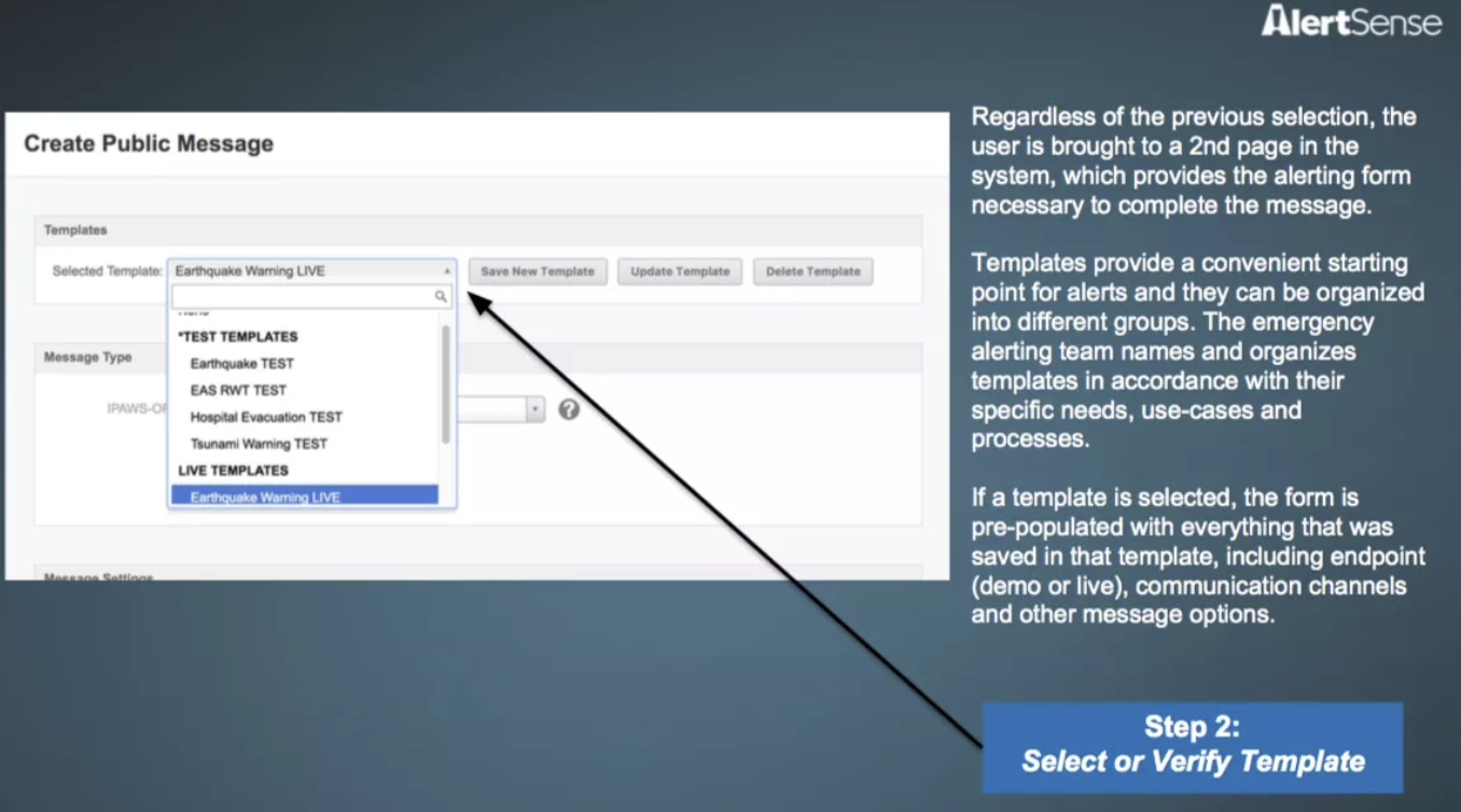
Select Existing Message Template from Drop Down
STEP 3
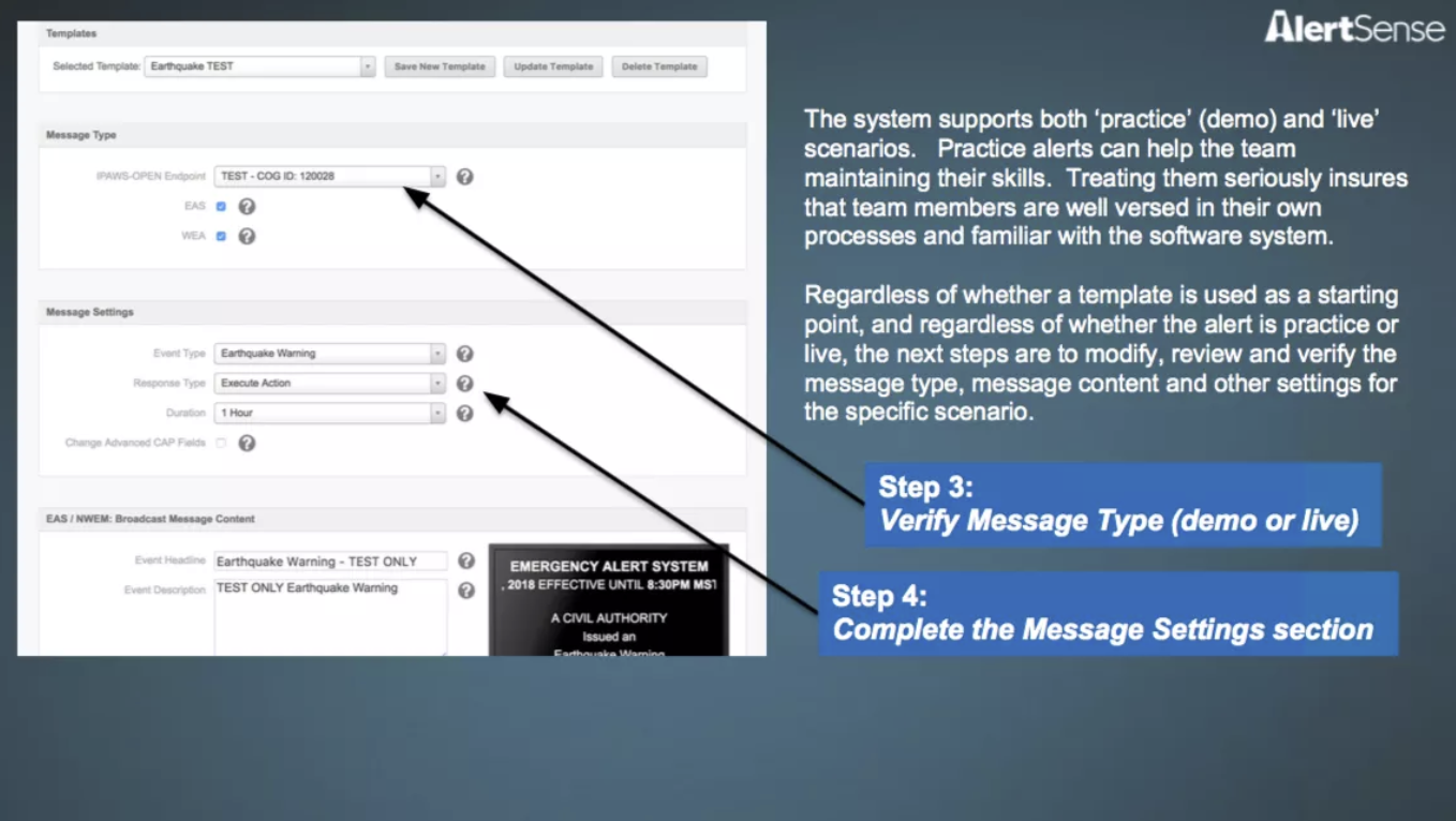
Verify Message Details and Modify Fields as Needed

STEP 4
Preview Message and Select Geographic Location
STEP 5
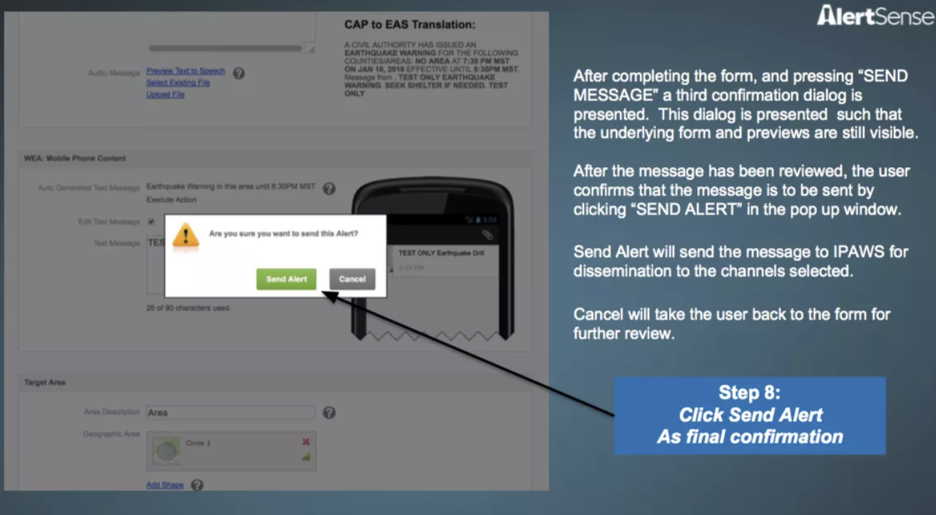
Send Alert After Confirming in the Modal
While these specs are not the most detailed look into the UI, they provided familiarity with the existing workflow operators follow to send a WEA.
A major win was discovering that message templates are used to pre-populate the fields within a WEA message. When operators are instructed to send out a WEA they must select the appropriate template from a lengthy drop down.
Without a clear answer as to what exactly caused Operator 1's error, it is highly possible that the operator selected the incorrect template from this template selection drop down.
Distinction Between WEA Template Types
A WEA template is either a DEMO or LIVE type. It is important to understand the difference between the two types.
DEMO WEA
Used for testing purposes to ensure operators and system are prepared when needed
Usually associated with a specific disaster or event, but not always
Often signified to public as drill only by appending “TEST” in the message
LIVE WEA
Informs the public of an actual impending disaster or event
Mentions the disaster and what should be done for the public’s safety
When studying AlertSense's UI, I noticed that operators have to specify and save a specific template as a DEMO or LIVE type. The only indicator of its type is in the template name and description.
This means that AlertSense would require users to create a separate DEMO and LIVE template based on if there was a tornado drill vs a real tornado warning.
This unnecessarily leads to a large amount of template duplication. This further complicates finding the right template among the long list of items in the UI's template selection drop down.
Mapping the Process of Sending a WEA
Mapping out the system of sending WEAs allowed me to visualize the roles of the software, operator, and larger HEMA organization within the larger process. It helps create a mental model for understanding the processes that lead to a WEA being sent, either correctly or incorrectly.
Existing System Diagram for Sending WEAs
PROBLEM STATMENT
How can we improve the processes surrounding wireless emergency alerts to reduce the chance of error and keep the public well informed?
With this problem statement in mind, I made the following mindmap to connect the various aspects that contributed to the accident.
Summative Mindmap of the Hawaii Nuclear Scare
Major Issues with WEA Software UI
Using my mindmap as a reference, I arrived at three key issues with the software UI.
Template names are responsible for communicating message type
EVIDENCE Poor naming choices by operators that don’t highlight DEMO vs LIVE type
SOLUTION Signify DEMO vs LIVE type when sending a WEA rather than creating a specific template for a LIVE and DEMO version of the emergency
Previews for LIVE alerts do not appear different from DEMO alerts
EVIDENCE DEMO previews often appear similar to LIVE previews at quick glance, only distinguished by mention of “test”
SOLUTION Require preview to better emphasize message type so operator understands what they’re sending
Confirmation modal does not display any preview
EVIDENCE Operator confirmed their sending of the LIVE WEA while believing it was a DEMO
SOLUTION Display important details about the WEA in the confirmation modal, emphasize message type more prominently
WEA Message Type Iconography
I started resolving the UI by first designing an icon to visually represent each template type.
These icons are to appear in conjunction with the written message type in order to aid in quick recognition.
DEMO WEA
LIVE WEA
A Redesigned UI
To visually show how my key issues could be resolved, I designed a clickable prototype that demonstrates how I might better organize the process of sending a WEA to improve system transparency for operators.
The homepage features all WEA templates alphabetized in a scrollable Template Directory.
Compared to the previous UI's template selection drop down, users are able to search through the database of WEA templates with more fluidity and clarity.
The homepage also conveniently displays active messages with appropriate message type iconography to improve system visibility about active WEAs.
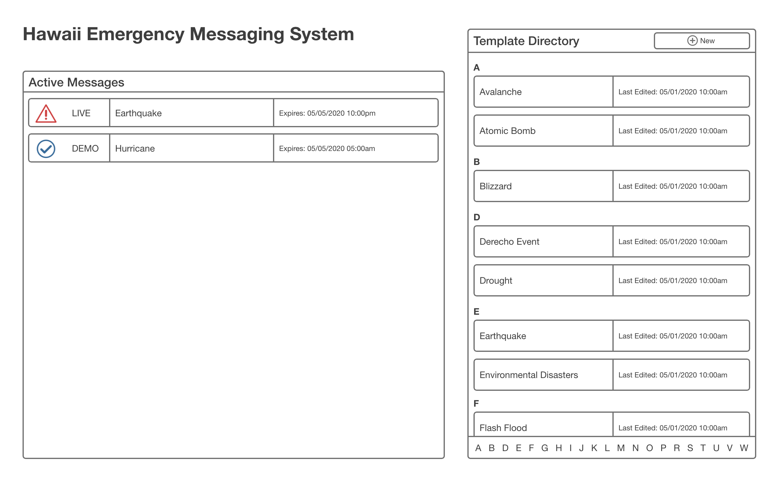
Each template page acts as the hub for sending a LIVE or DEMO version of the template.
Click “Prepare to Send” button to begin the WEA sending process or "Edit" to amend the template. These action buttons separate the task of sending or editing a WEA from the process of reviewing a template's content.

While preparing to send the WEA, users manually select the message type (DEMO vs LIVE) in the moment to force conscious decision making.
The number of templates in the system is reduced because the DEMO and LIVE version of a template are stored under one entity. With less templates and a clearer choice between LIVE or DEMO, it will be harder for operators to mess up the WEA message type they are sending.
Press the “Confirm and Send” button when ready to send WEA after last minute editing is complete.
The improved confirmation modal uses more pronounced signifiers to show a more detailed preview of the message that operators are intending to send.
The modal features message type iconography paired with a warning statement that more clearly highlights the WEA type.
Finally, I ordered the "Cancel" button before the now red-filled "Send" button to further encourage careful decision making.

Imagining A More Empathetic WEA
Most of my solutions seek to improve the current system of sending WEAs to prevent human error. However, they do not address how the current style of WEAs impact the general public.
Wireless Emergency Alerts lack the empathy necessary to encourage rational, productive behavior. Their messaging should instill a more productive sense of urgent preparedness rather than causing panic and stress.
A Redesigned WEA
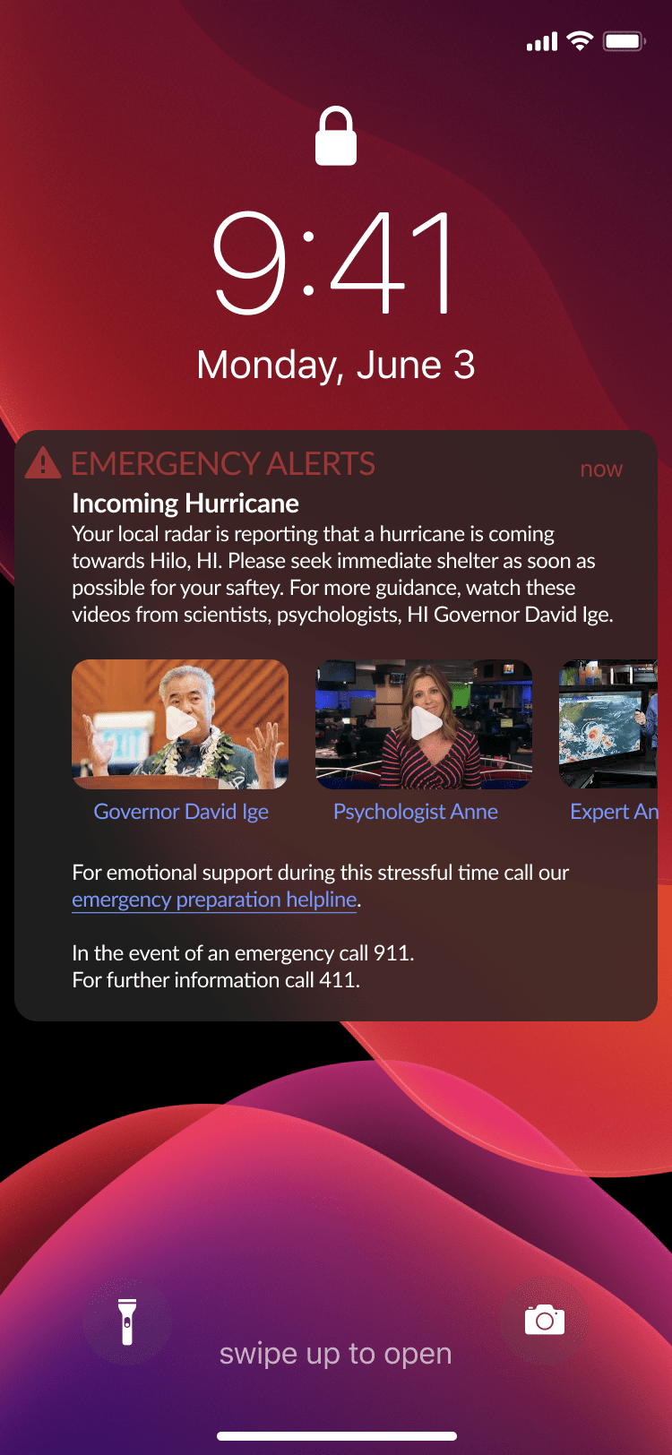
Instead of declaring disaster and offering minimal support to the public, this redesigned WEA offers informational and emotional resources to prevent panic.
Videos with guidance from government officials, psychologists, and scientists offer more personal assistance from trusted sources.
An emergency preparation helpline allows recipients to speak to a representative that can help them respond to the event safely.
Major Issues with System Safeguards
With the UI aspects of my synthesis resolved, I wanted to return to my analysis of the system processes. Taking into account the details of the accident once more, I arrived at three main problems and crafted a high-level solution for each.
Lack of monitoring of WEAs after operators send the messages
EVIDENCE Operator responsible realized his error later when he checked his phone
SOLUTION Require two people to send the alert together to reduce chance of error and have HEMA director approve major alerts
Unclear resolution process in place in the event of a WEA mistake
EVIDENCE Took 38 minutes for HEMA to send out an alert about their mistake
SOLUTION Create more formalized response process in the event of a mistake
Operators do not have enough training for their important role
EVIDENCE HEMA did not have regular WEA testing or training
SOLUTION Require more frequent WEA drills to give operators experience with the task
Optimizing the Process of Sending a WEA
To visualize these solutions within the larger process, I mapped out an improved process diagram that summarizes my thoughts on reimagining HEMA's established system...
Improved System Diagram for Sending WEAs
See More About This Project
ALSO CHECK OUT...
Surrounded By Systems: A Workbook in Design Systems
This 54-page workbook details my exploration into example systems that surround design, technology, human behavior, and beyond. The piece heavily considers how design process in itself is a system and how designers can leverage this heuristic to meet careful problem analysis with holistically considered intervention.
